
Matisse in Focus, Tate Liverpool, ends 2nd May, free
“I do not literally paint that table, but the emotion it produces upon me.”

The Snail, 1953. Blog lesson #1: take better photos through glass.
What luck for me that I am able to start this blog with a piece about a Matisse exhibition. I love Matisse. His work makes me feel warm, and happy, and alive. I have been to the Hermitage in St Petersburg twice and the top floor room where they have 3 of his most famous paintings is one of my “happy places”. For the last few months Tate’s ground floor gallery has housed a free showcase of Matisse paintings from their collection, the biggest draw being The Snail. This is the last chance anyone has to see The Snail for a while; due to the paper degrading it’s going into storage next week and won’t be moving outside of London again. Knowing it’s the big draw it’s been prominently hung, so as soon as you enter the room some people (at least that I overheard) get the fun of saying “I could have done that”. But if you think that then look around the rest of the room, because it there that the story is told.
Is The Snail a snail? is the question people seem to want answered when looking at it.

Back IV, 1930
What this room is saying is that Matisse, whilst never opting for pure abstraction, was playing with forms from the beginning. The series of Backs I-IV along the far wall demonstrate this perfectly: made in intervals over a 21-year period, each one plays with the shape of the figures in a different way. By Back IV (1930) the poor woman is a set of shapes – but still clearly a woman. In the same way, you could say that The Snail is definitely a snail because you can follow a shape.
One of the main reasons that Matisse is my favourite painter is because of his use of colour. Colour is a wonderful thing: it creates moods, changes your emotions, just by existing in a particular place. Matisse’s colours jump out at you, or suck you in, and make you feel things. And you feel they are chosen very deliberately to do exactly what Matisse wants. Besides The Snail there are a few pictures in here which show different ways in which Matisse used colour to create effects, of which my favourite was The Inattentive Reader (1919). The colours here are soft, and cosy, and make it feel like this would be a nice room to be in. But then you become aware of her face which is – cross? Frustrated? All is not well here, at any rate. The effect is jarring in the way it wouldn’t have been if Matisse had been more goth and just gone for black or grey. I feel more for this woman because of it.
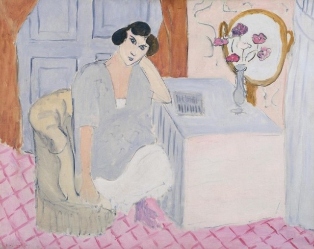
The Inattentive Reader, 1919
My mission with this blog is not to play the academic, so I’m not going to pretend to know exactly the reasons Matisse chose these colours. But I like the combination. If Matisse had chosen to show “this is a snail” with brown and green spirals it may have been more accurate, but nowhere near as entertaining. Scale is important here too: I haven’t even talked about how big this piece is, but it’s very big, which emphasises the brightness of each individual colour. It seems to make my eye follow the round shape – a ‘shell’, if you like. To the people who say “I could have done that” I want to say, “would you have chosen your colours as carefully? Would you have laid them out in position with so much attention?”. It’s those details that make this picture work for me.
Is The Snail a snail? Well, it uses the form of a snail to beautiful effect, and I feel like for Matisse, that was the point. Go and make up your own mind while you still can.